
What is in a logo?
This summer I paired up with my favorite local artist and asked her to create a logo for Be.
When I talk to people about why the name Be: I explain how I wanted to shed the layers of “should”, “have to”, “better do” and create a space where a person can return home to themselves. A place where they can Be. and where they can decide what if anything follows after that Be.
I also wanted that logo to represent my company values and stand as a visual reminder of why I choose to show up in this way for my clients day in and day out. I believe in growth, openness, independence and a sense of community. I believe this is created by showing up for each other and letting yourself still believe in life’s seemingly magical moments.
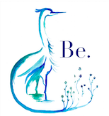
It is a lot to ask for a logo and I knew that Sarah Fenerty was the woman for the job. The soft lines of the heron extending into flowers of new growth captures these values and the space I am working to create for all of you.
A heron represents independence and is known to be an alluring bird that can flourish in a crowd. When you look up the symbolic meaning behind a heron you find words like” Calm, grace, patience and being present”- yes! These are all things I hope to bring to my clients through our work together. These are essential to growth.
The flowers in the logo show growth ad one’s ability to make something new, to lean into the magic of life.
It was a lot to ask for in a logo and a great reminder that until we ask the answer aways remains no. Yet by reaching out and taking a chance Sarah Fenerty created a logo that had all the parts I wanted to convey and I got to further support an amazing local artist. Sometimes, life can be a win-win- see….magic.
